In this post I walk through the iterations I made while generating this image:
The source code that generated this piece can be found here, and I describe many of the functions I use in my article on generative water color.
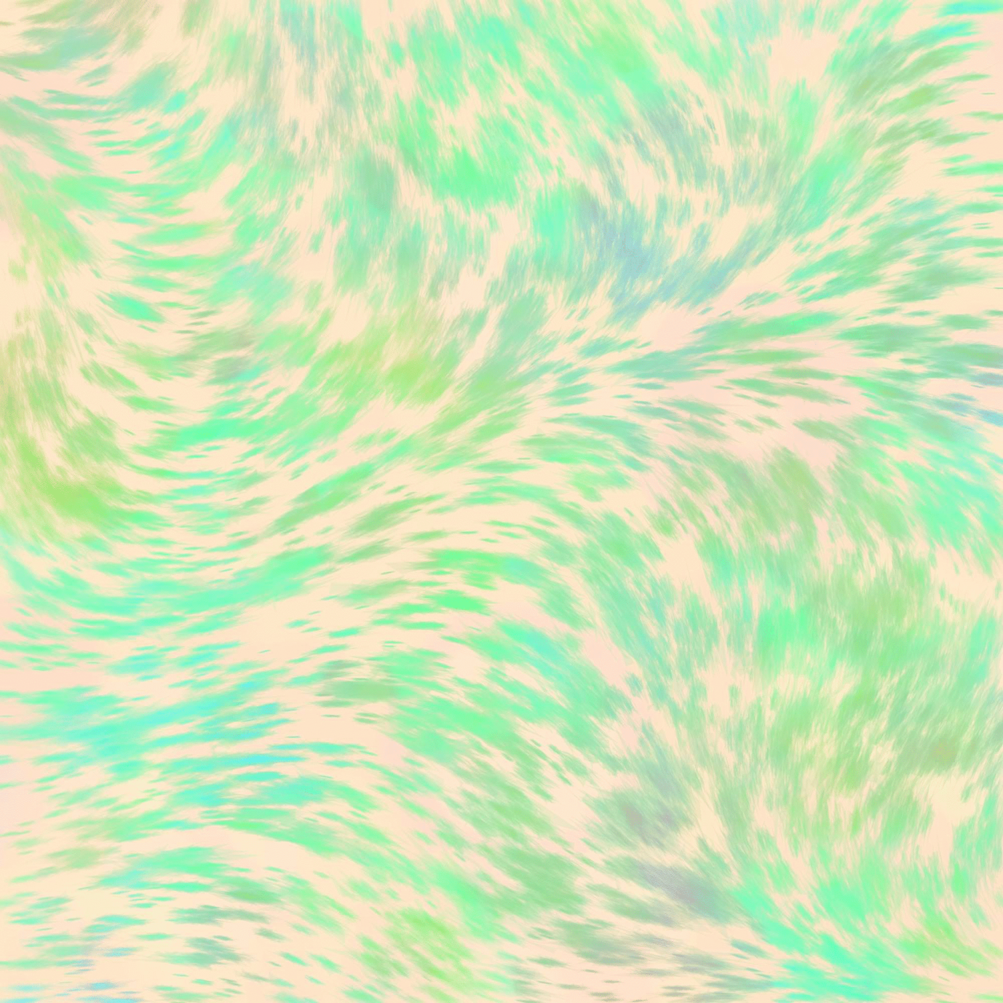
1: Strokes
I originally wanted to build an ocean wave. I started with many short rectangles placed randomly and oriented according to noise (noise * 2 * pi). I also warped them a bit. I planned to make these into clouds.
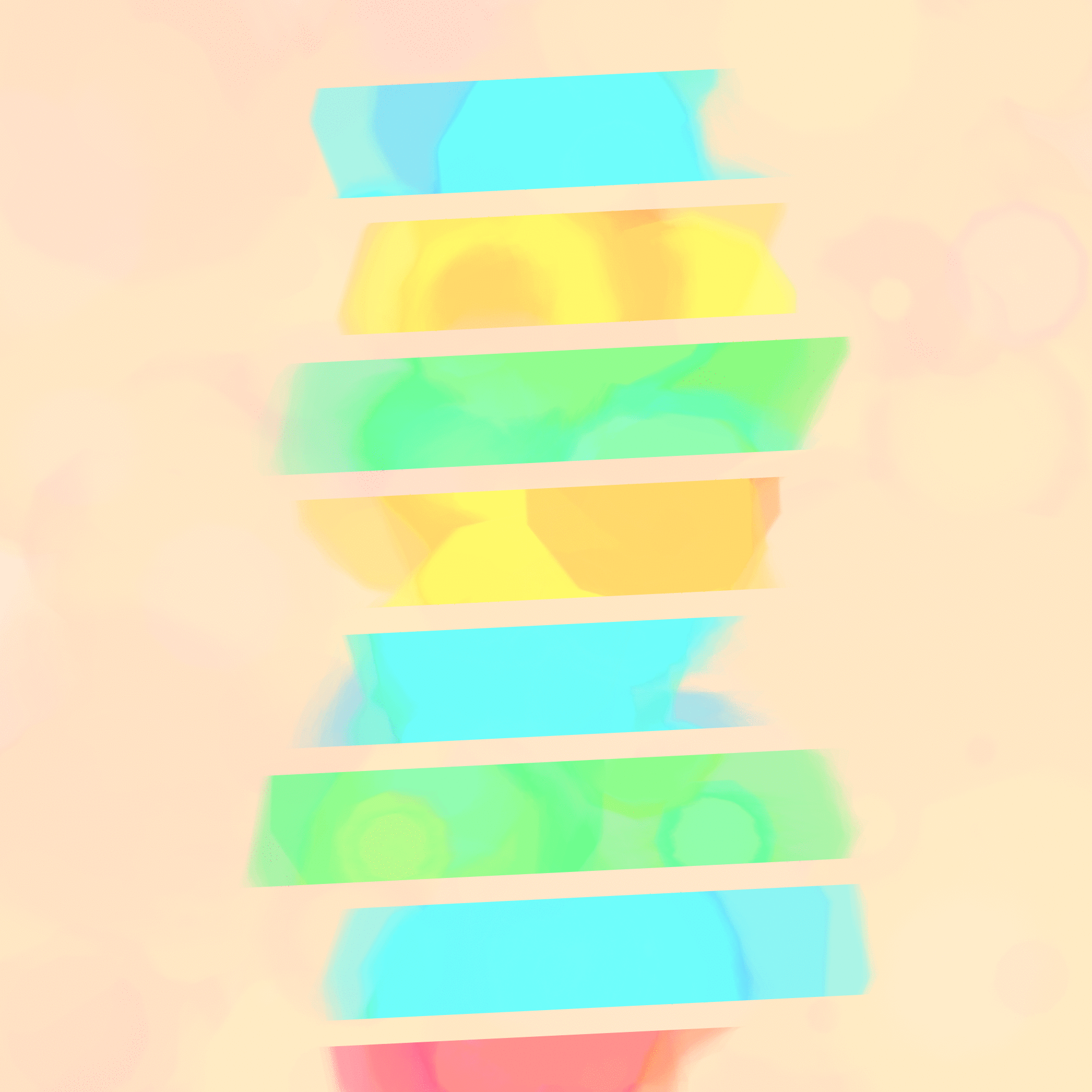
2: Grouped Strokes
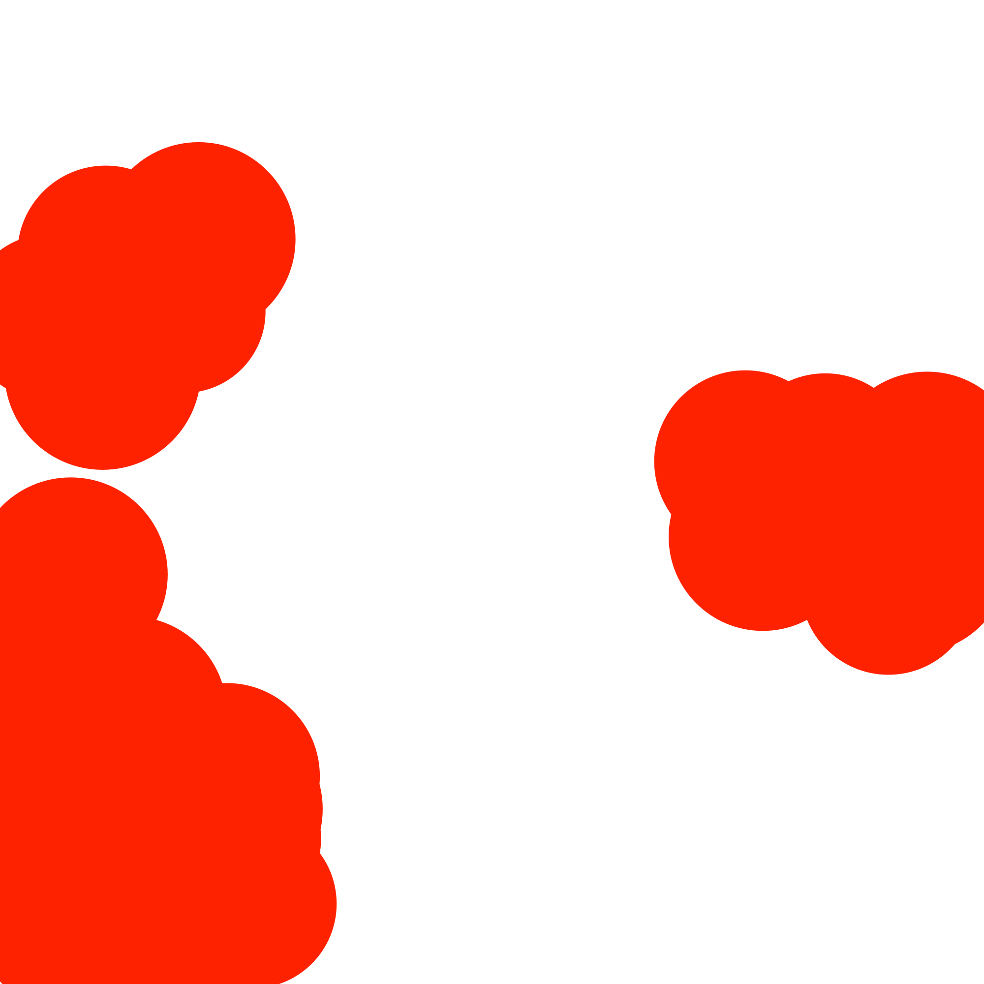
I wanted to bunch these into groups, so I pulled out the classic circle packing algorithm and inverted it, so in each run all the circles must overlap (the lower of the two debug images above). I spawned the strokes only within these blobs:
3: A Wave
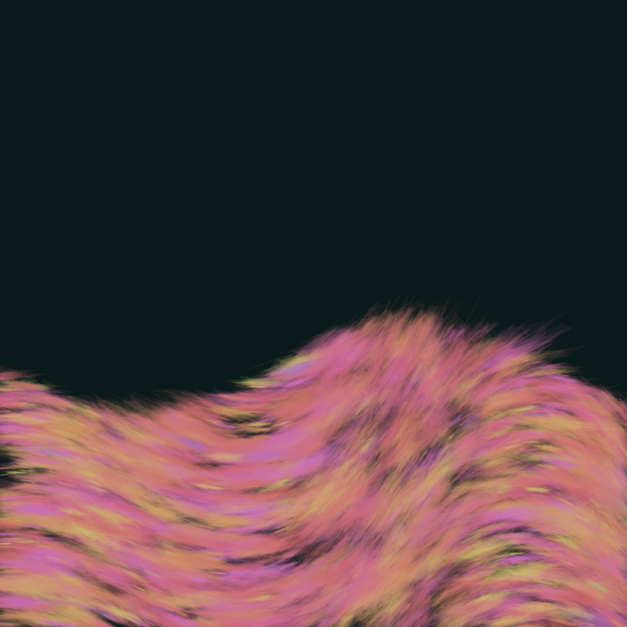
The consistency looked unlike a cloud, so I tried using the strokes to draw the wave. A convex combination of noise and a sine wave stretching the whole frame determined the orientation of the strokes. I liked the boundaries of the strokes but not much else, so I started looking for another pattern these could make a good alpha matte for.
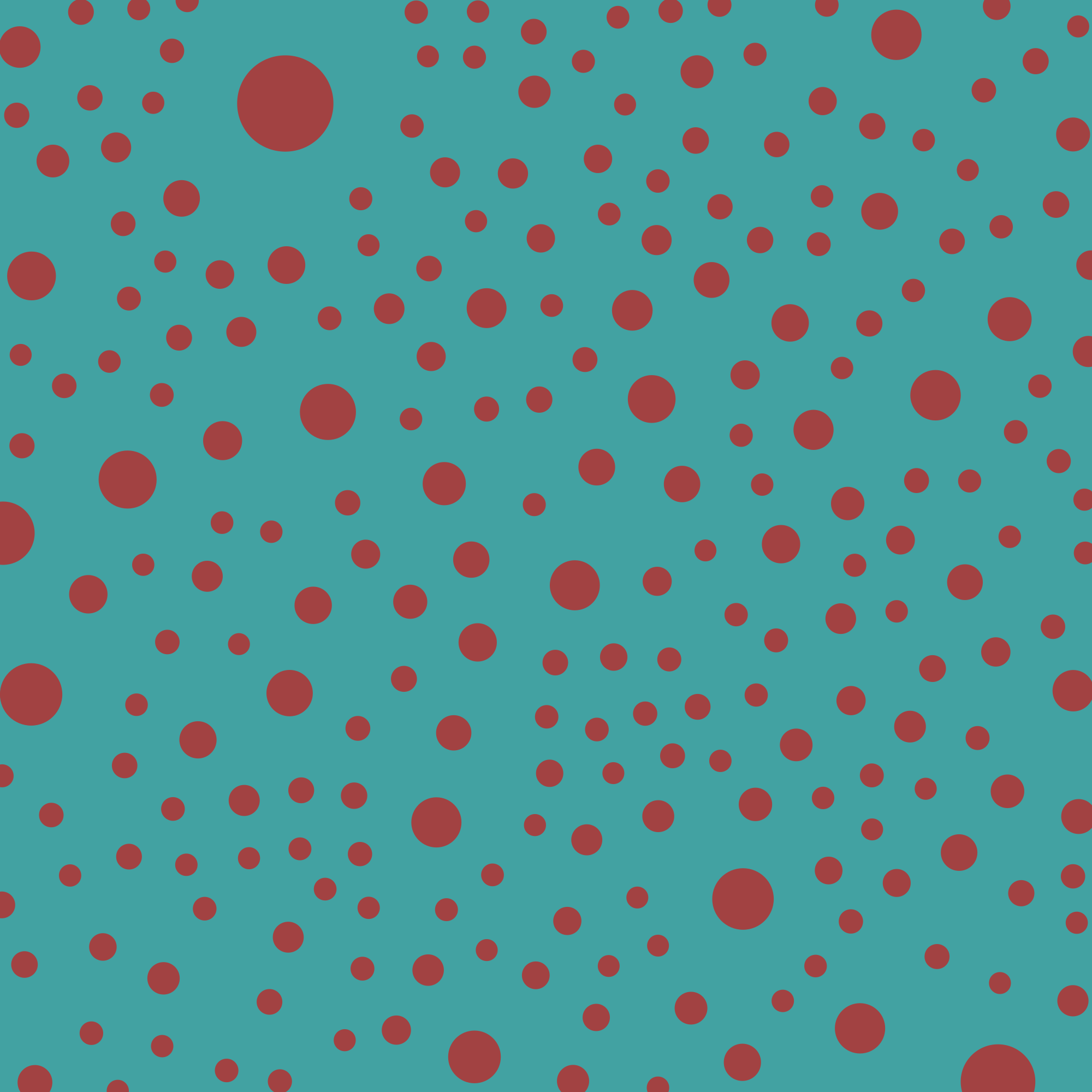
4: Circles
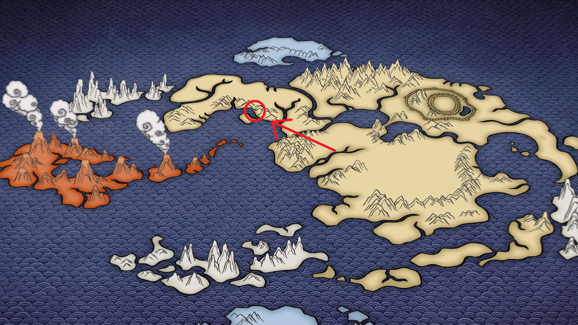
I watched some title sequences and liked the ocean illustration in the titles for Avatar The Last Airbender, particularly, the rings in the circles:
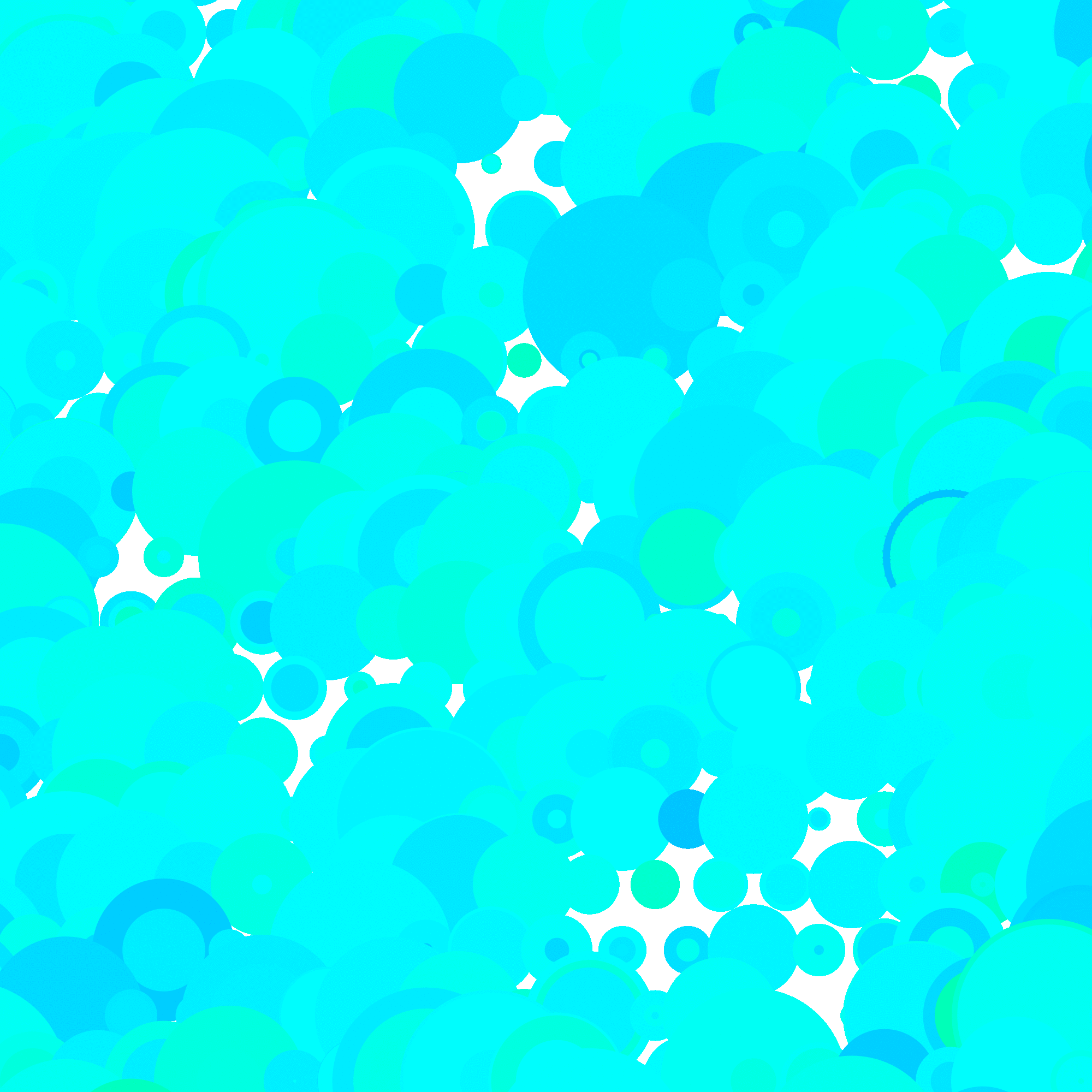
I plopped some circles with rings in them down, but it looked boring so I estimated all the circles as polygons and deformed them to a degree determined by the noise value beneath them:
5: Alpha Matte
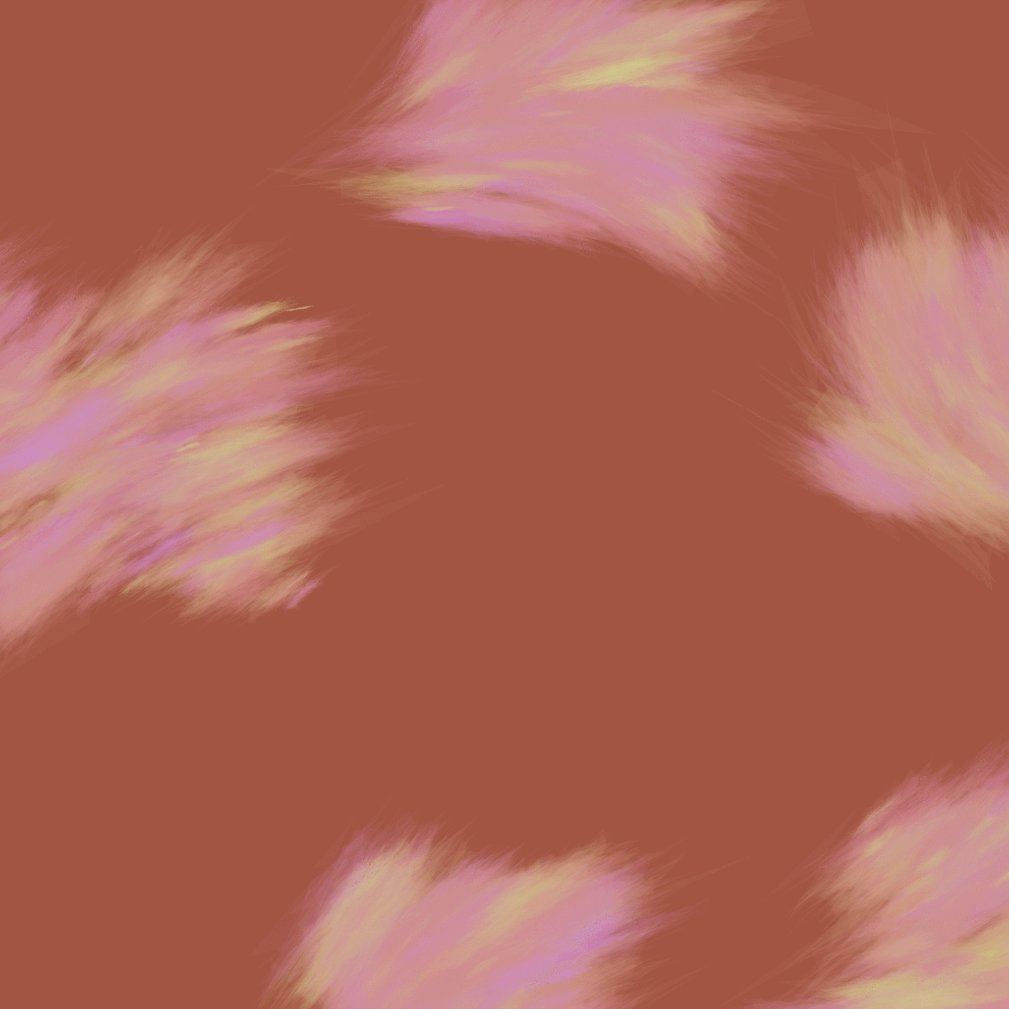
The stroke groups from earlier are an alpha matte for the deformed circle pattern. Each group is a matte for a different pattern. It's starting to look cool but can't stand on its own against a solid color.
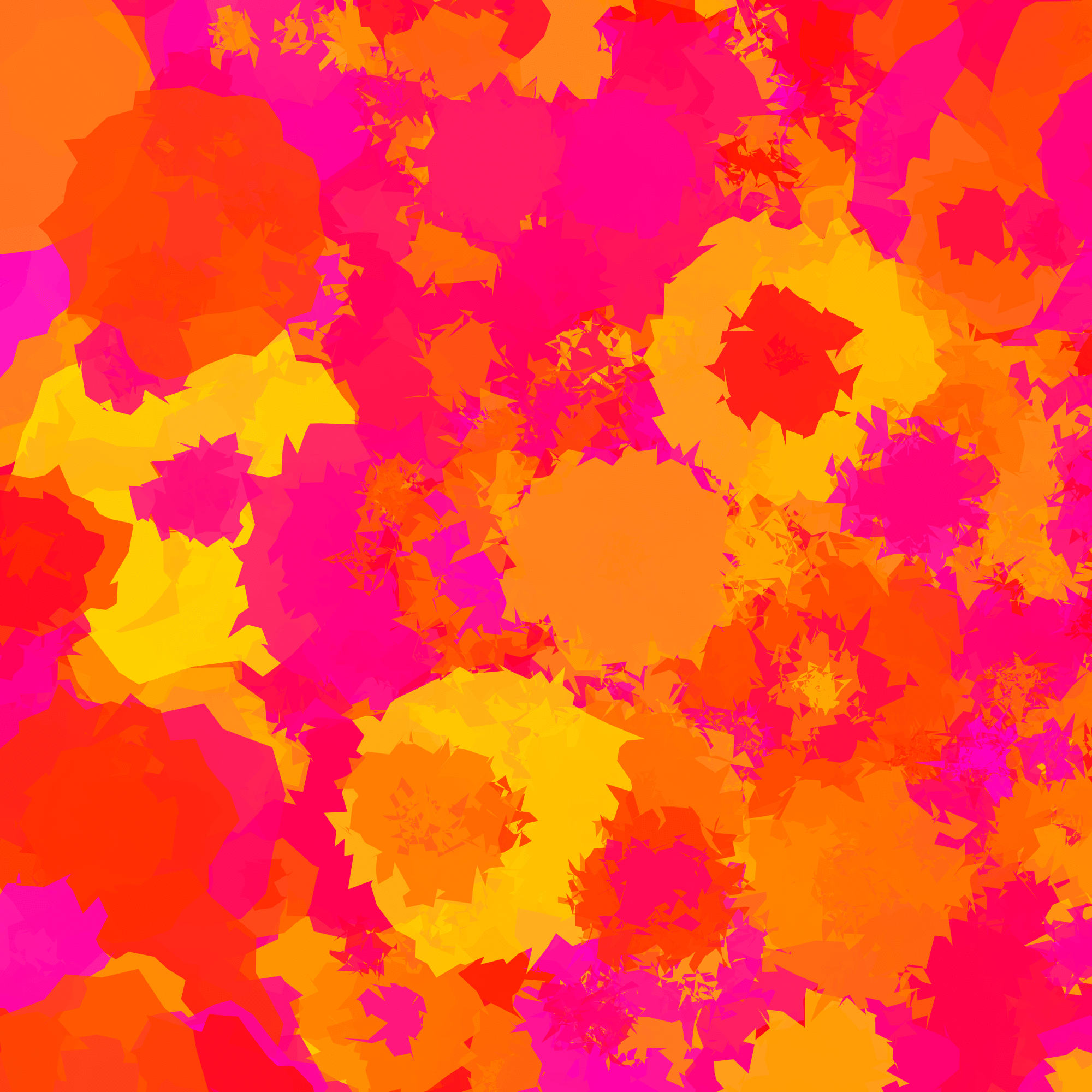
6: Backdrop

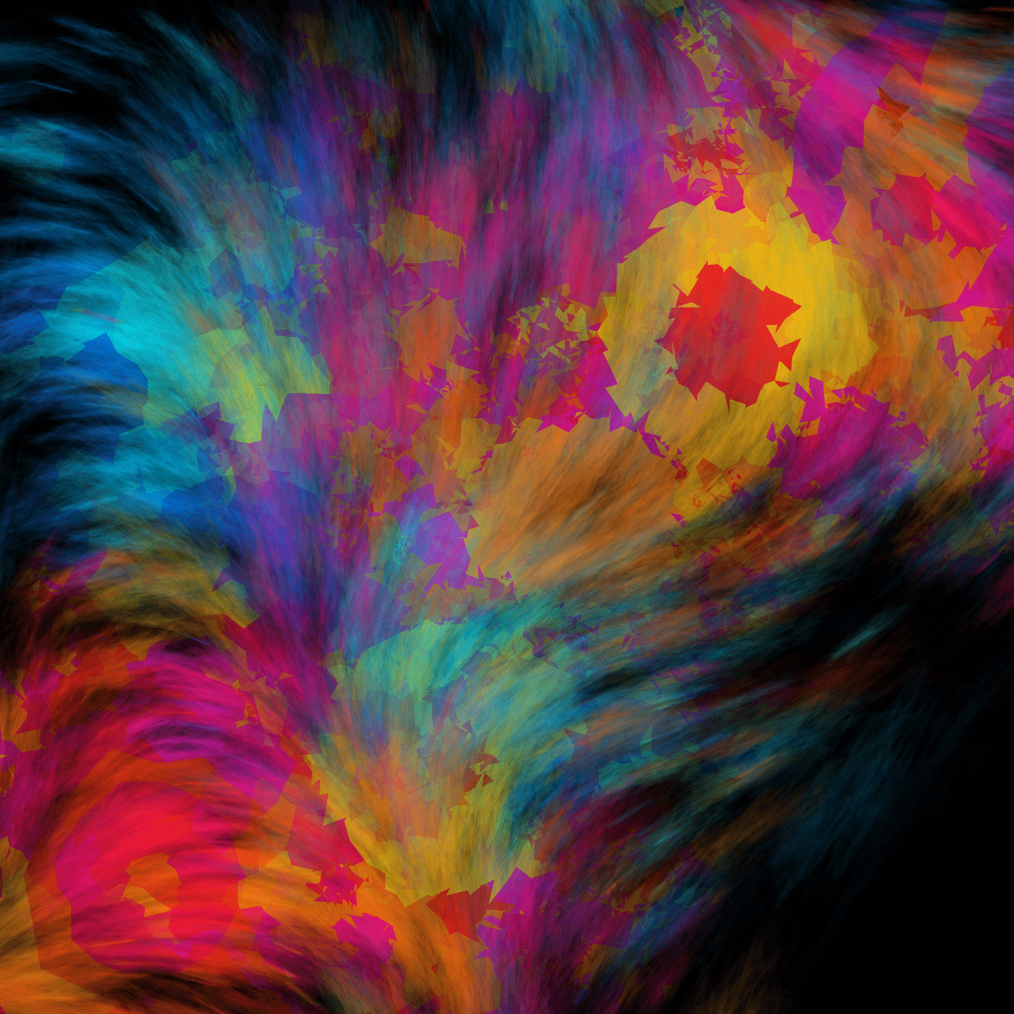
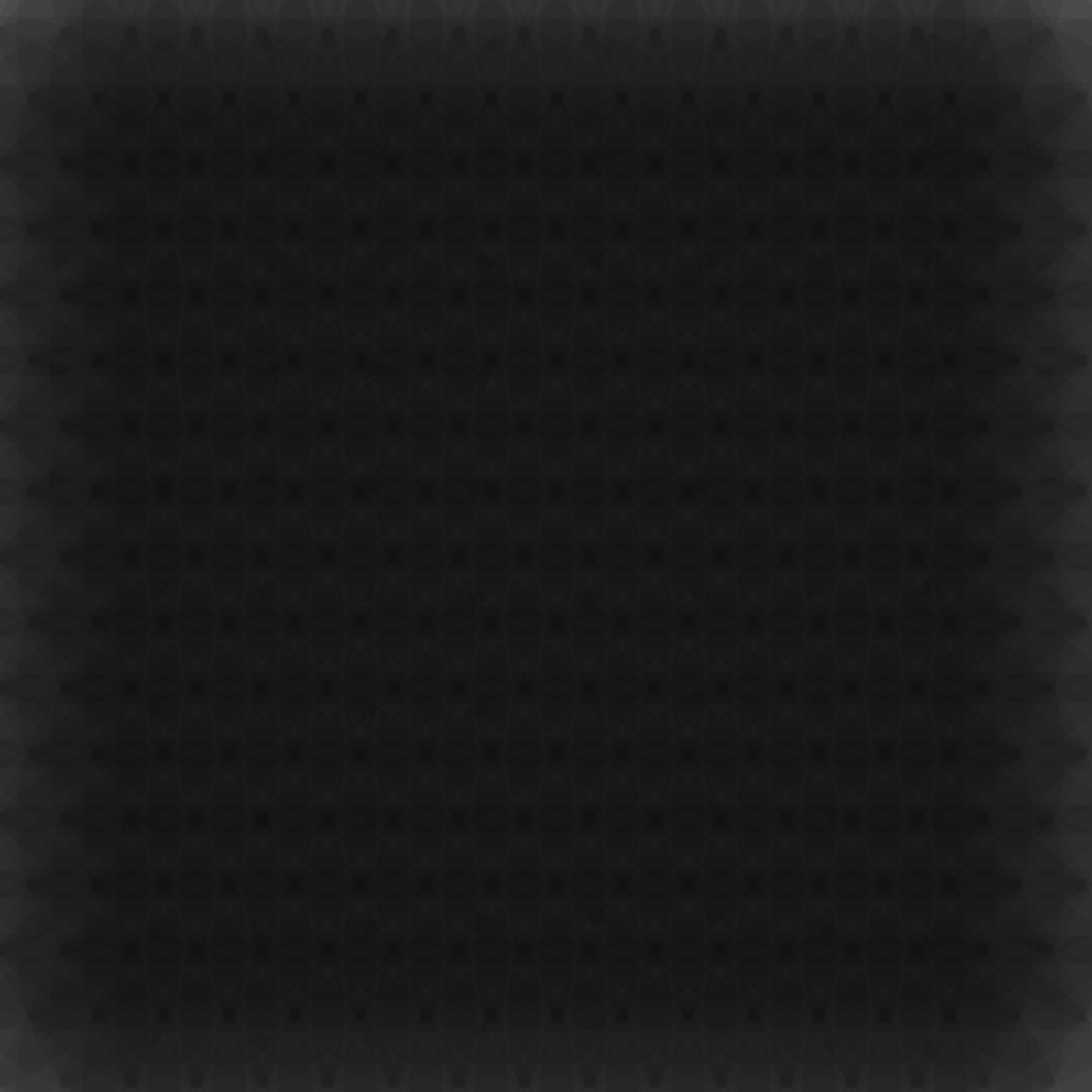
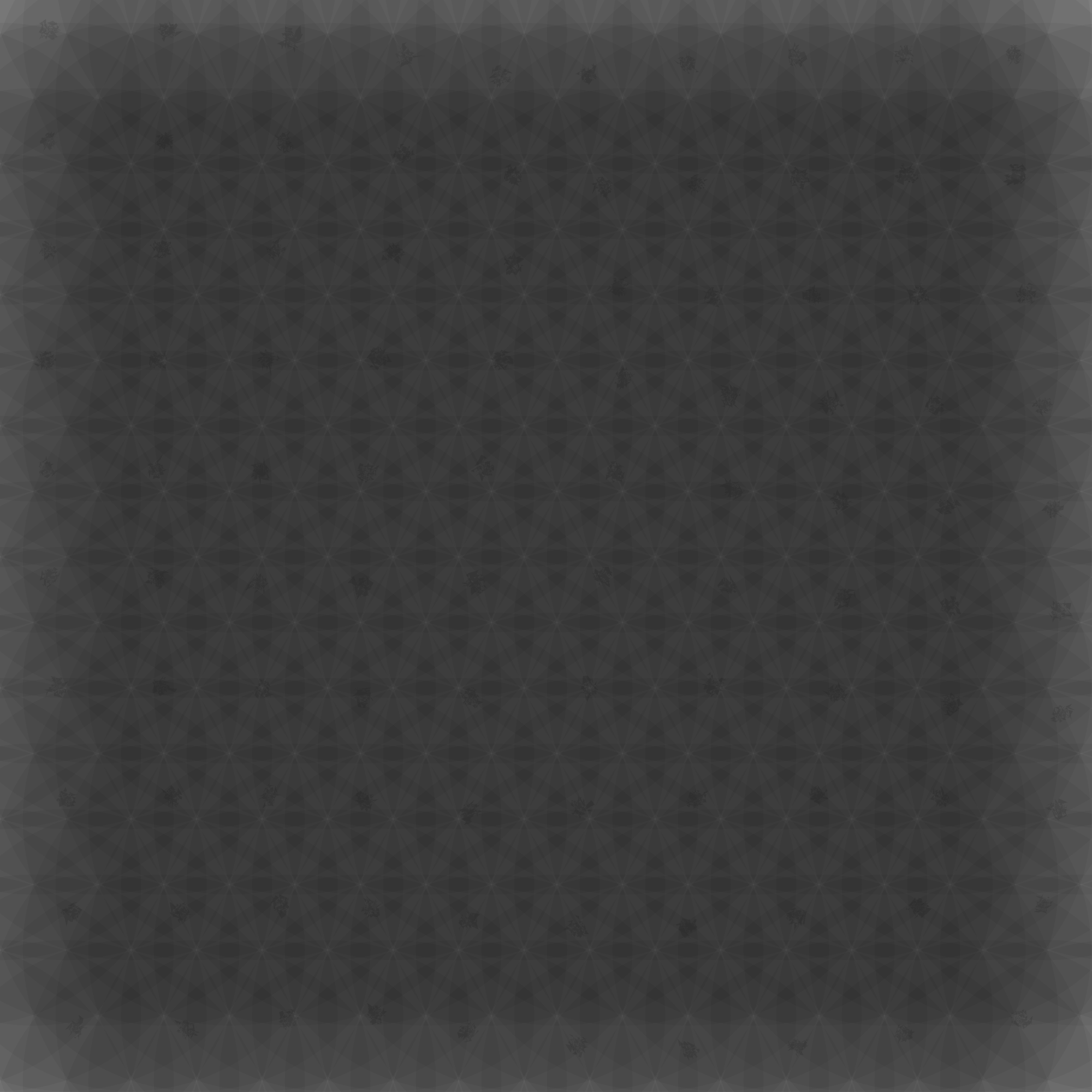
When experimenting with the circles from Avatar The Last Airbender, I started with the layout in the title sequence but didn't like it. The first thing I tried for the backdrop was to bring back that layout with transparent circles. The size and opacity of the circles vary, which generates surprisingly diverse patterns. Here's more:

7: Composition
This looks neat, but it's too obvious what the separate layers are, which makes it look like two kind of neat things arbitrarily placed on top of one another rather than a single really neat thing.
8: More Granular Blending
To get the separate patterns to blend with more granularity I made the strokes more sparse and limited their warp to only their lengthwise dimension. For the final render I just cranked up the warp depth and number of dashes.
9: More Consistent Background
The background distracted me from the foreground, so I made a background out of the same circle plotting from #4, but blurred with less hue variance. Above is my debug image comparing potential backgrounds.
I eventually settled on the debug image's own background, and decided the foreground mattes ought to be blurred all well.
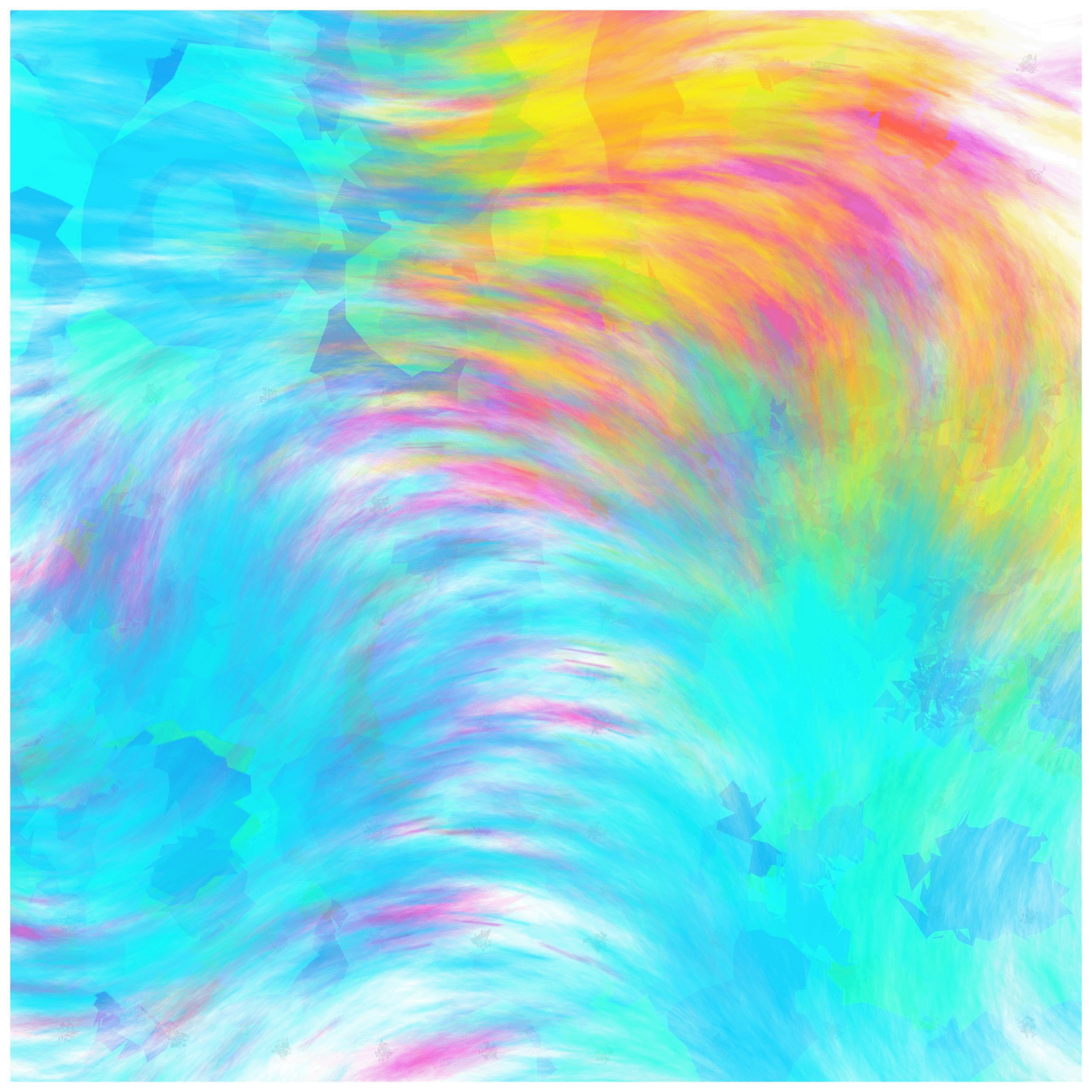
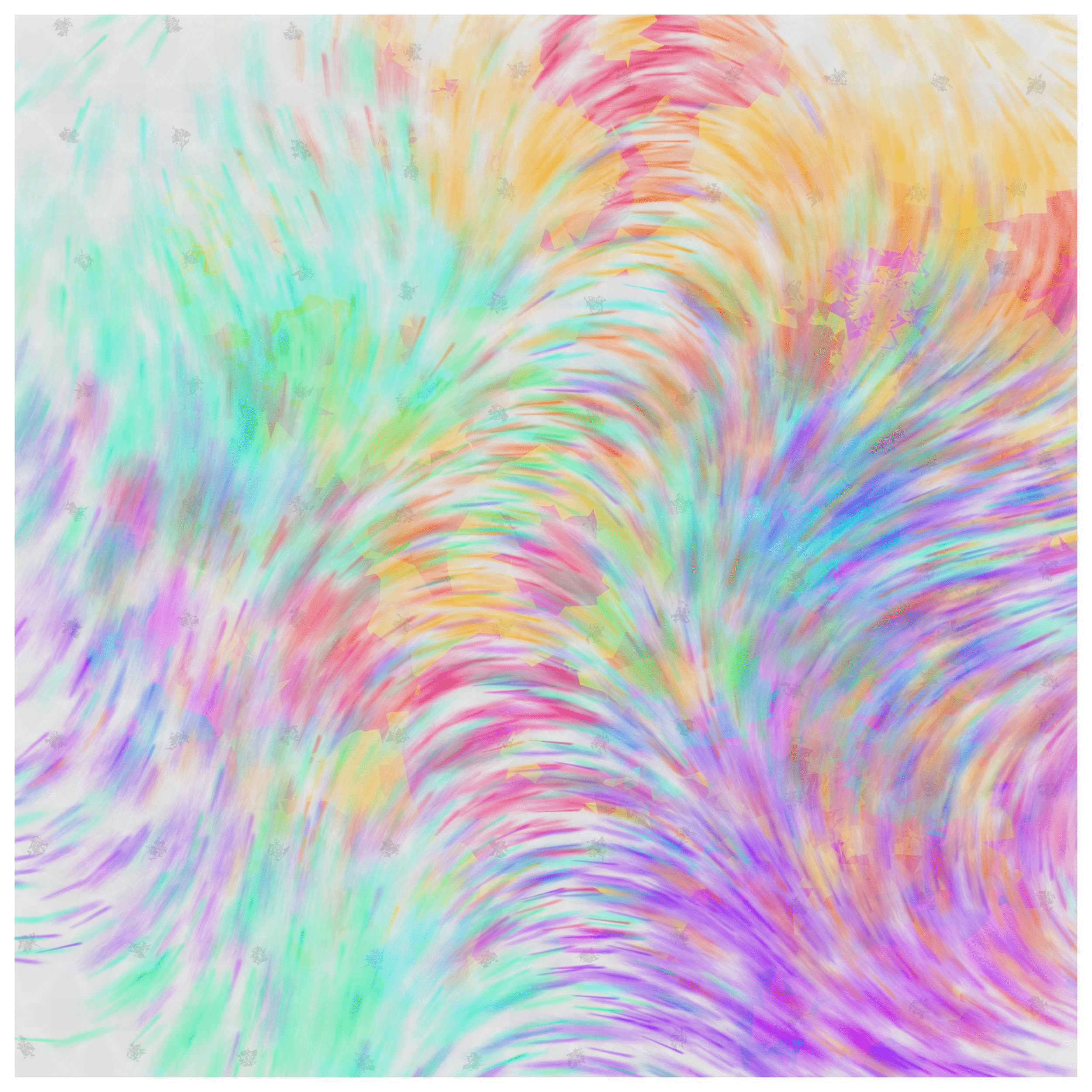
Conclusion
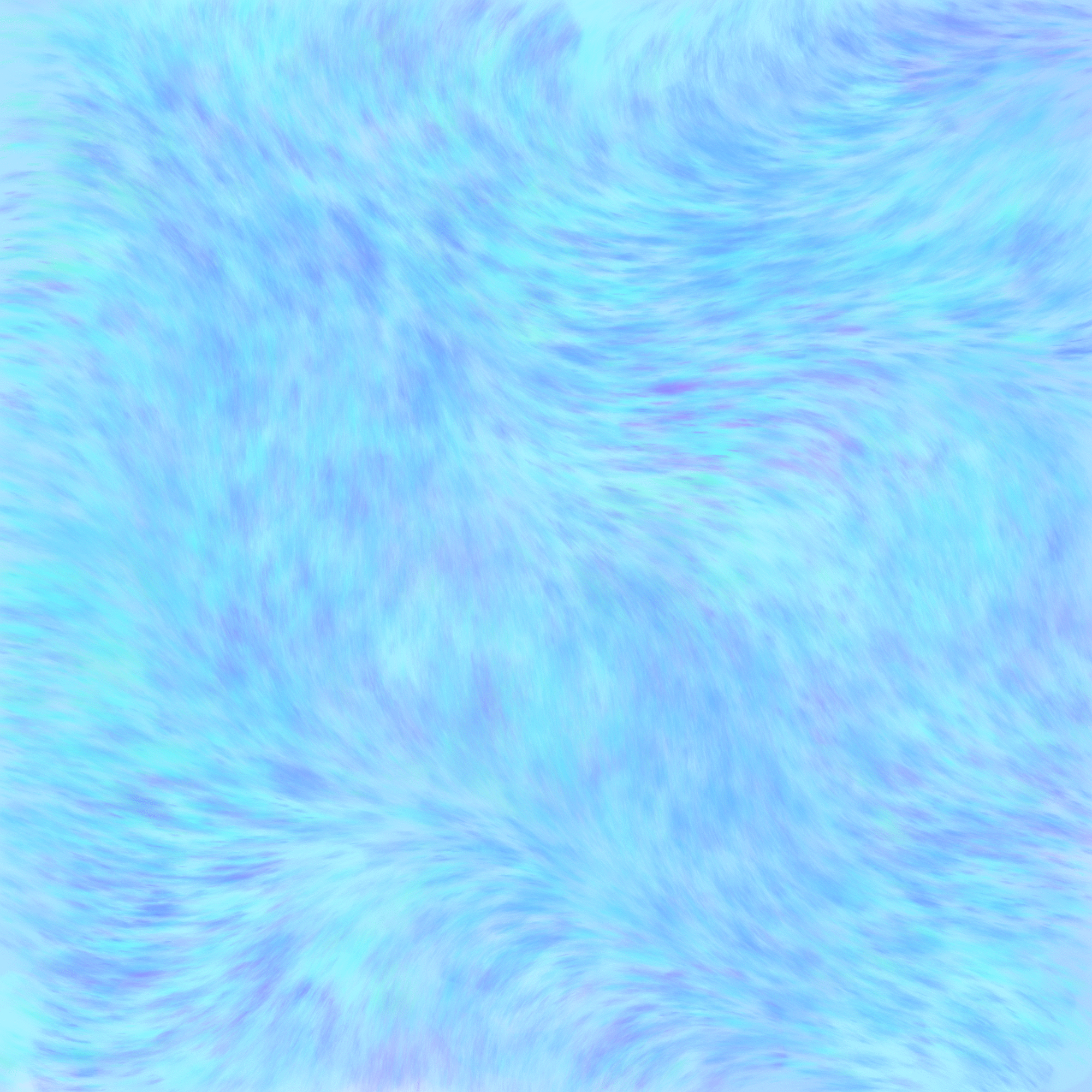
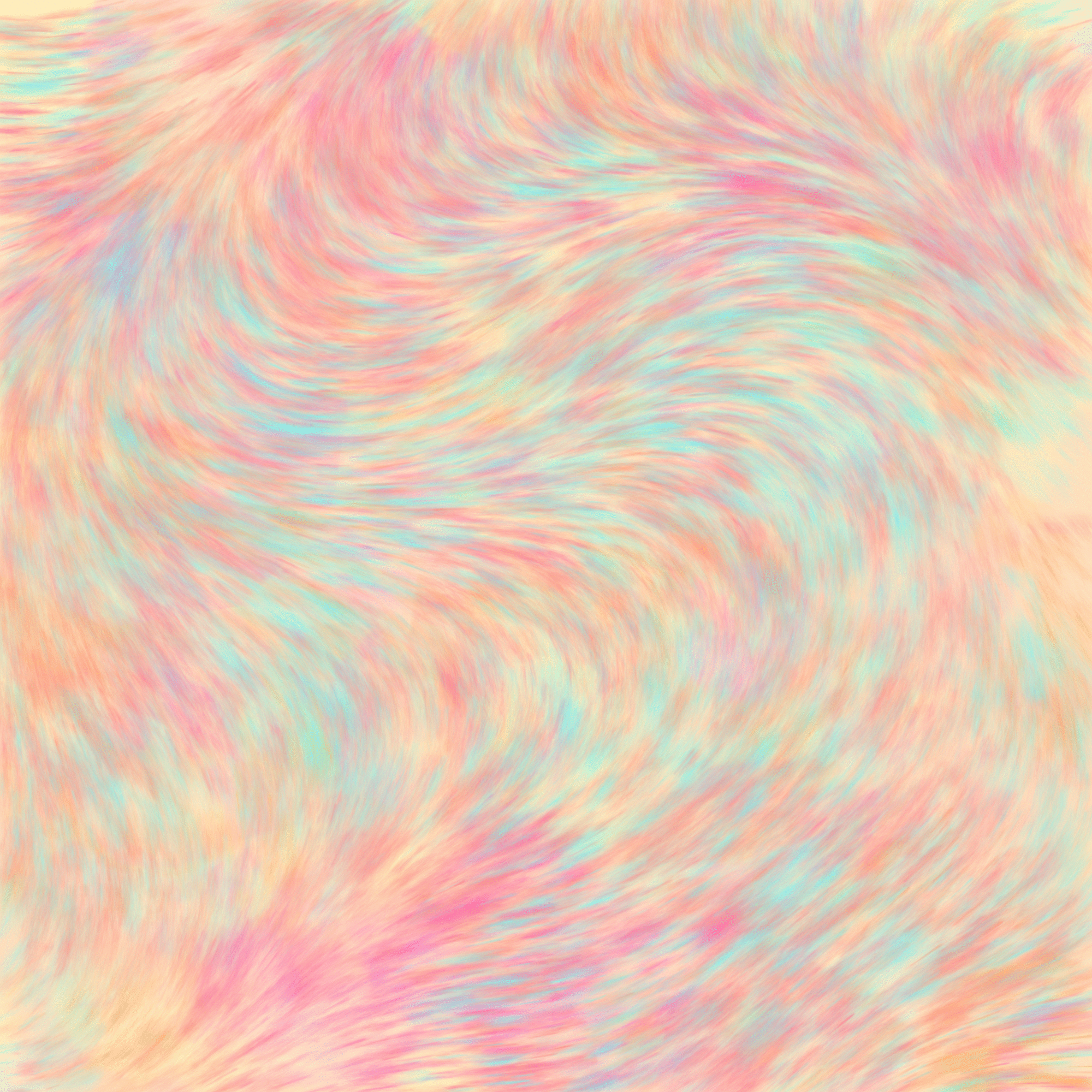
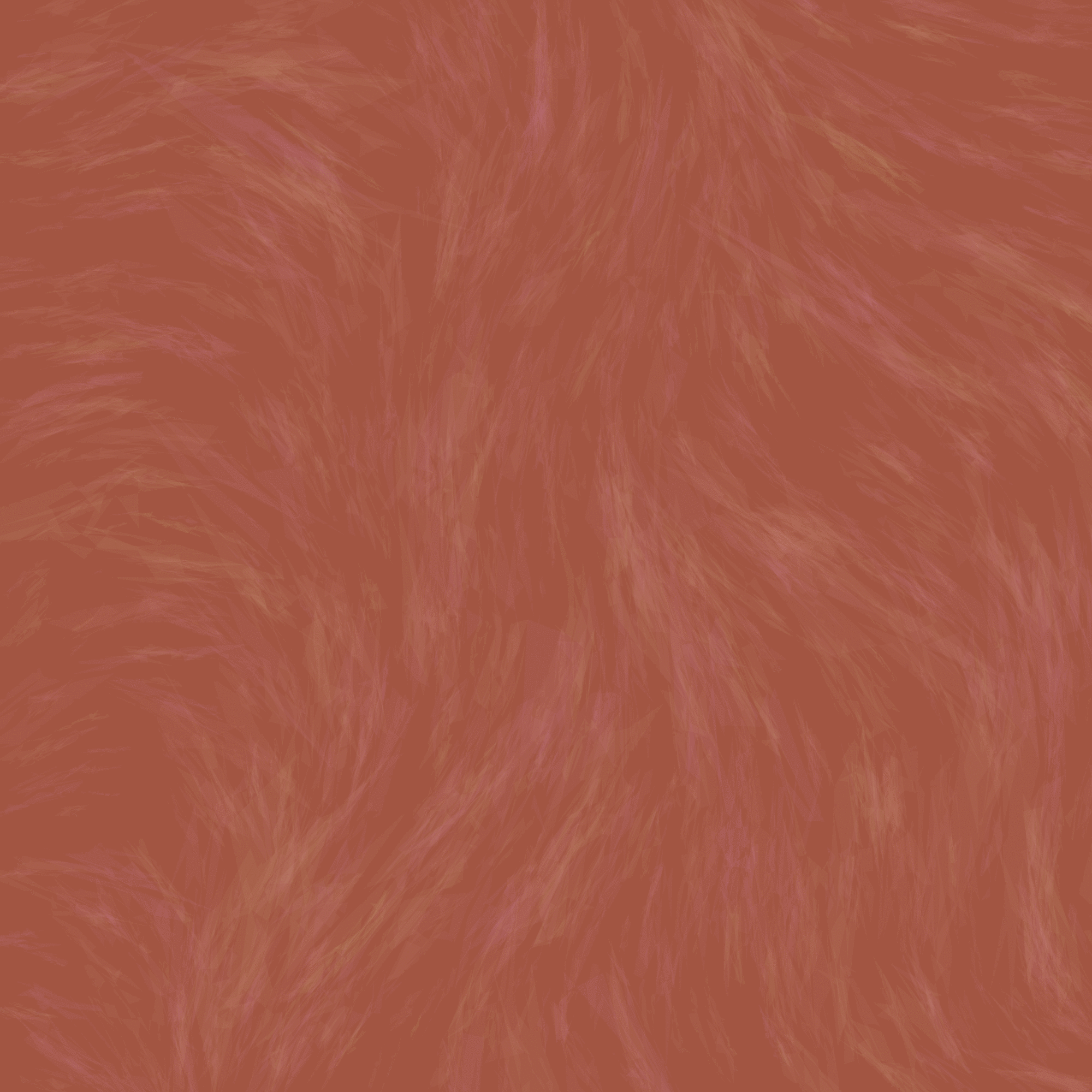
Here are the images generated by the final program, varying in color palette and dash characteristics.